

Many business owners think website conversion is about flashy design, tricks, or pressure.
It’s not.
A website converts when visitors quickly understand:
- What you do
- Who it’s for
- Why they should trust you
- What to do next
Good conversion is not manipulation. It is clarity + trust + direction.
1) Clear Message in the First Few Seconds
If a visitor lands on your homepage and feels confused, they leave. Your homepage should answer these questions immediately:
- What is this business?
- Who is it for?
- What problem does it solve?
- What should I do next?
If the first screen is unclear, design quality will not save it.

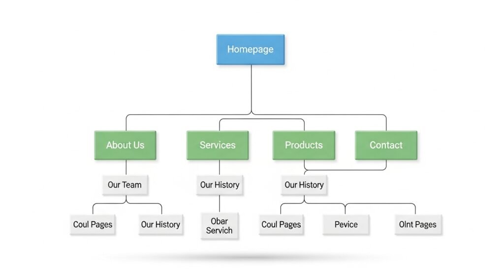
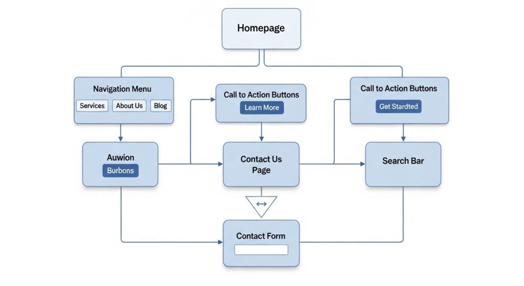
2) Simple Structure and Easy Navigation
Visitors should not work hard to understand your site.
A high-converting structure is simple:
- Home
- About / Services
- Contact / Consultation
Navigation should be obvious. Buttons should be readable. Important pages should be reachable in one click. Complexity kills momentum.
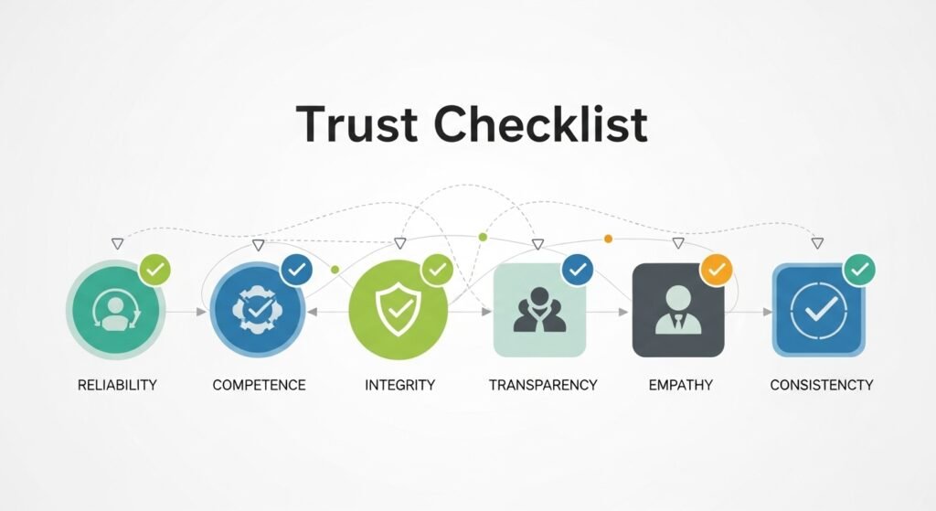
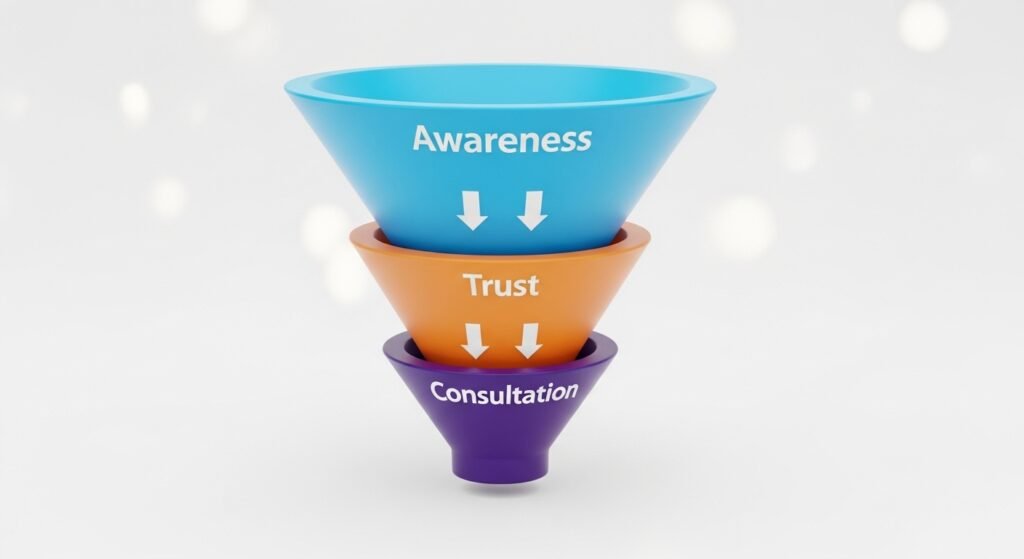
3) Trust Signals Without Hype
People decide with caution, especially when money is involved.
Trust grows when your site includes:
- honest language
- real service descriptions
- clear process steps
- realistic expectations
- professional presentation
Trust does not grow from:
- exaggerated claims
- fake urgency
- vague promises
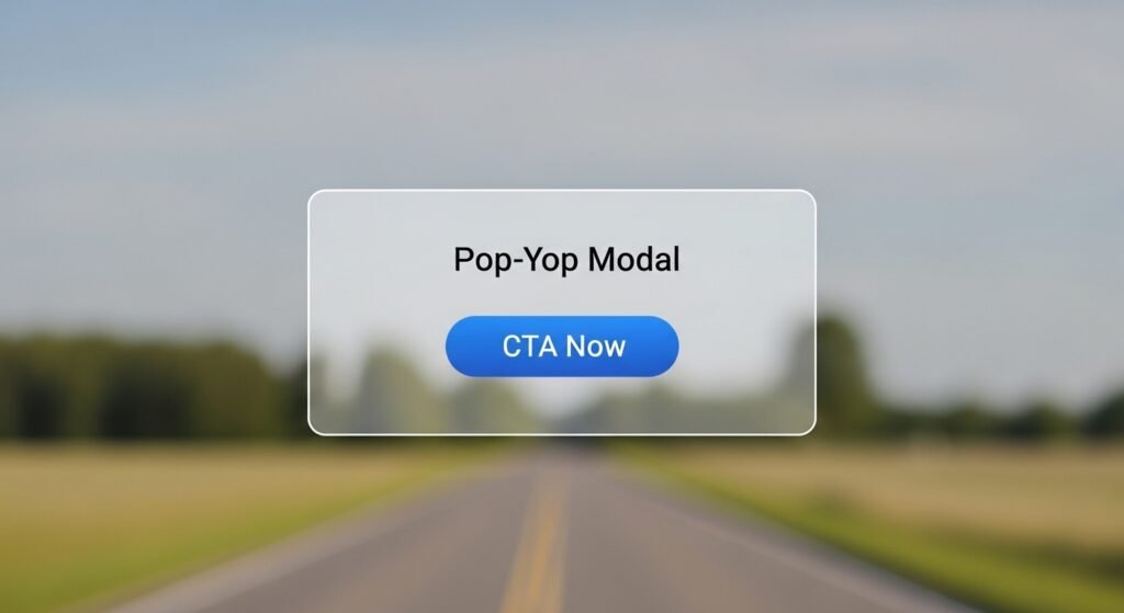
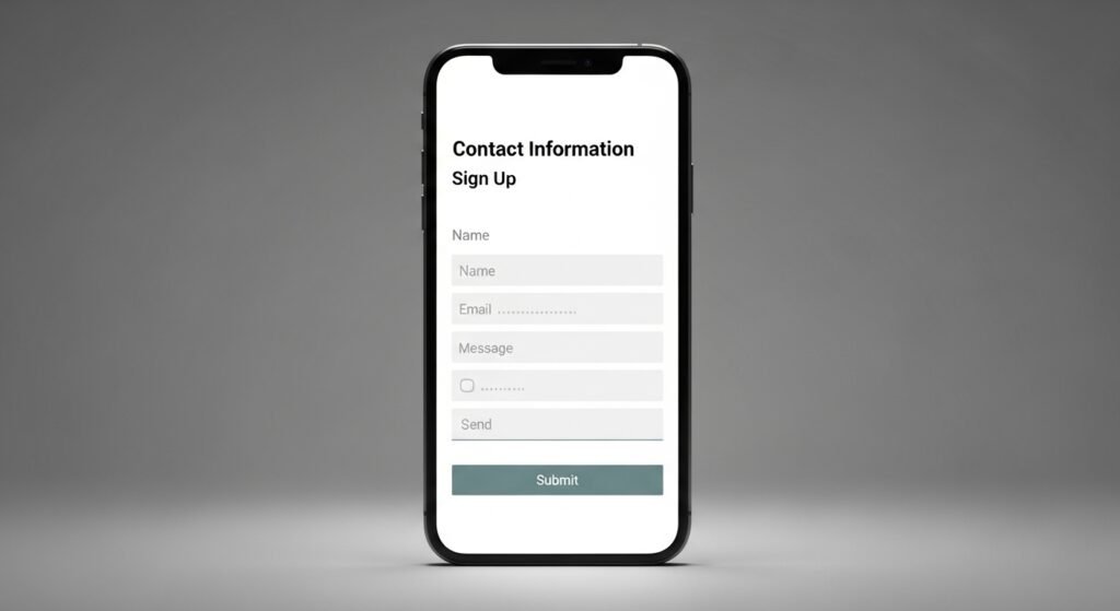
4) Calls to Action That Feel Natural
A call to action should guide, not pressure. Better CTA examples:
- Request a Consultation
- Start a Conversation
- See Our Services
Avoid:
- “Act Now”
- “Limited Time”
- “Don’t Miss Out”
Visitors should feel respected, not pushed. See how we build clear, trustworthy websites: [Website Services → /services]
5) Content That Answers Real Questions
Conversion improves when people feel understood. Your pages should answer what they are already asking:
- Do I need this?
- How does it work?
- Is this business trustworthy?
- What happens after I contact you?
This is why helpful blog content matters. It pre-builds confidence before the first call.
👉 Explore ethical evaluation standards: [Halal Index® → /halal-index]
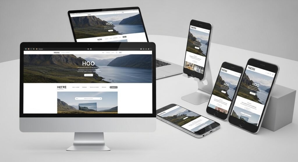
6) Fast, Mobile-Friendly, and Friction-Free
Even good copy fails if the experience is frustrating. Conversion drops when:
- pages load slowly
- forms are too long
- mobile layout breaks
- contact steps are unclear
A converting site should be:
- fast
- readable on phone
- easy to contact
- technically clean
7) One Clear Next Step
Every page should guide visitors toward one clear action. Examples:
- Request consultation
- Send inquiry
- View services
If every page asks for different actions, visitors hesitate. Consistency creates confidence.
Final Thought
Websites convert visitors into clients when they are built on:
- clear messaging
- simple structure
- visible trust
- respectful CTAs
- helpful content
- clean user experience
No pressure tactics required. If your site is not converting, the issue is usually not “more marketing.” It’s often clarity and trust gaps in the website itself.
If you want your website to convert better without hype or manipulation, we can help you build it the right way.